nib brand imagery
Images in customer communications play a very important role in conveying messages about the nib brand and our target market. As a result, the style of images we use must meet a refined but flexible brief which ensures we produce a strong point of difference between nib and its competitors.
We use a balanced combination of photography and illustration to facilitate humanised, comfortable and confident interaction between our members and nib's digital products and services.
For general guidelines on imagery usage within Mesh-enabled experiences, refer to our Foundations documentation.
Sign-off & approval
Any usage of illustrations and photography (excluding iconography*) across non-whitelabeled projects needs to be approved by nib's brand team before development or deployment. This is to ensure that selected imagery is appropriate for context, is validated against other usage of any particular image across our network, and is in line with our brand guidelines and proposition. Once your design(s) are ready for approval, please submit your Figma link or mockups to [email protected] for review.
*For guidelines specific to iconography, refer to its Mesh documentation.
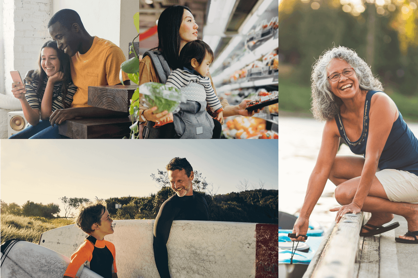
Photography
Our photography is guided by two sets of principles that capture a spectrum of growth on our members' journey with nib. "The journey to good health" is represented by a sliding scale for what kind of photography we use and the context it's used in. That scale is book-ended by two guiding principles:
- Your health in your hands - the start of your journey
- Getting you on your way - when you can live life to the fullest.
Not all images need to live at either end of the scale; instead it should guide image selection based on where the prospective member might be on their health journey.
Your health in your hands
The start of your journey
The start of your journey should be where we encourage trust and shine a positive light on health. It's optimistic and inviting, and makes good health feel tangible.
- Authentic optimism, focusing on confidence
- People actively taking steps towards good health
- Vulnerability and strength through intimate compositions
- Portraits or candid moments
- Relatable and approachable, encouraging trust and assurance
- Natural and unforced
- Warm colours and natural lighting
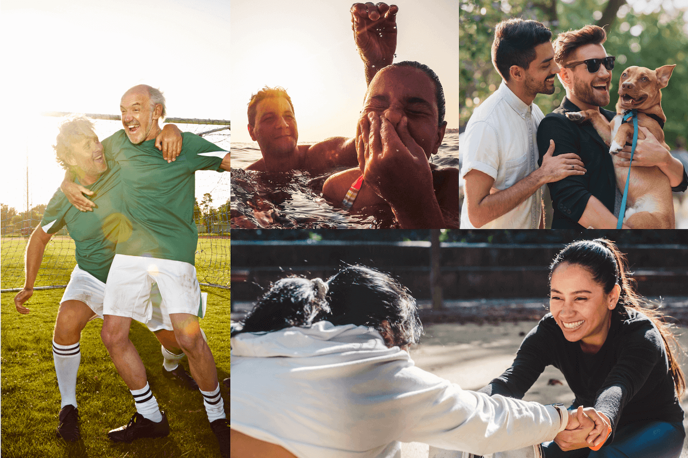
Getting you on your way
When you can live life to the fullest
When people are on their way, we can celebrate the benefits of good health and show people embracing this sense of liberation. It's emotive and dynamic, and should reflect a universal aspiration.
- People living life, empowered by the freedom of good health
- Everyday moments of joy that are relatable and desirable
- A sense of activeness through dynamic lighting and movements
- Expressing and sharing positivity with others
- Aspirational without exclusivity - energy through prevention
- Warm colours and natural lighting
Photography don'ts
To ensure photography aligns with our brand proposition, we've put together a few guidelines of what to avoid when selecting photographic imagery. Try to avoid:
- Photos shot from awkward angles that aren't flattering to the subjects
- Images shot from too far away, in a way that isn't intimate, or is - detached from the moment.
- Hard flash photography that washes out natural skin tones
- Clichéd scenarios of "wellness"
- Photos depicting activity or behaviour that could be seen as dangerous or risky for those involved
- Subjects that appear uncomfortable or distressed
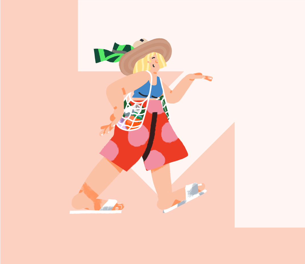
Illustrations
Our illustrations are an integral part of our asset library. They have been created to align with our brand proposition and act to visually represent "empowering prevention". As a design feature, illustrations bring aspirational and approachable personality to both our internal and external touchpoints, and can break up the visual flow of otherwise rigid pages and structures. Created by renowned Los Angeles-based illustrator Sebastian Curi, our initial illustration library embodies that sense of personality through its depiction of intersectional traits, lifestyles, activities and relationships, providing a dynamic, personable and inclusive range of images to facilitate emotional connections.
For ease of access when mocking up designs in Figma, we have included high resolution png variants as Components in our Foundation library. These are provided primarily as creative assets for ideation and exploration, but given their high resolution, should be suitable in most cases for creating exportable assets.
As per any imagery usage, approval must be sought from nib's brand team before any assets are put into production.
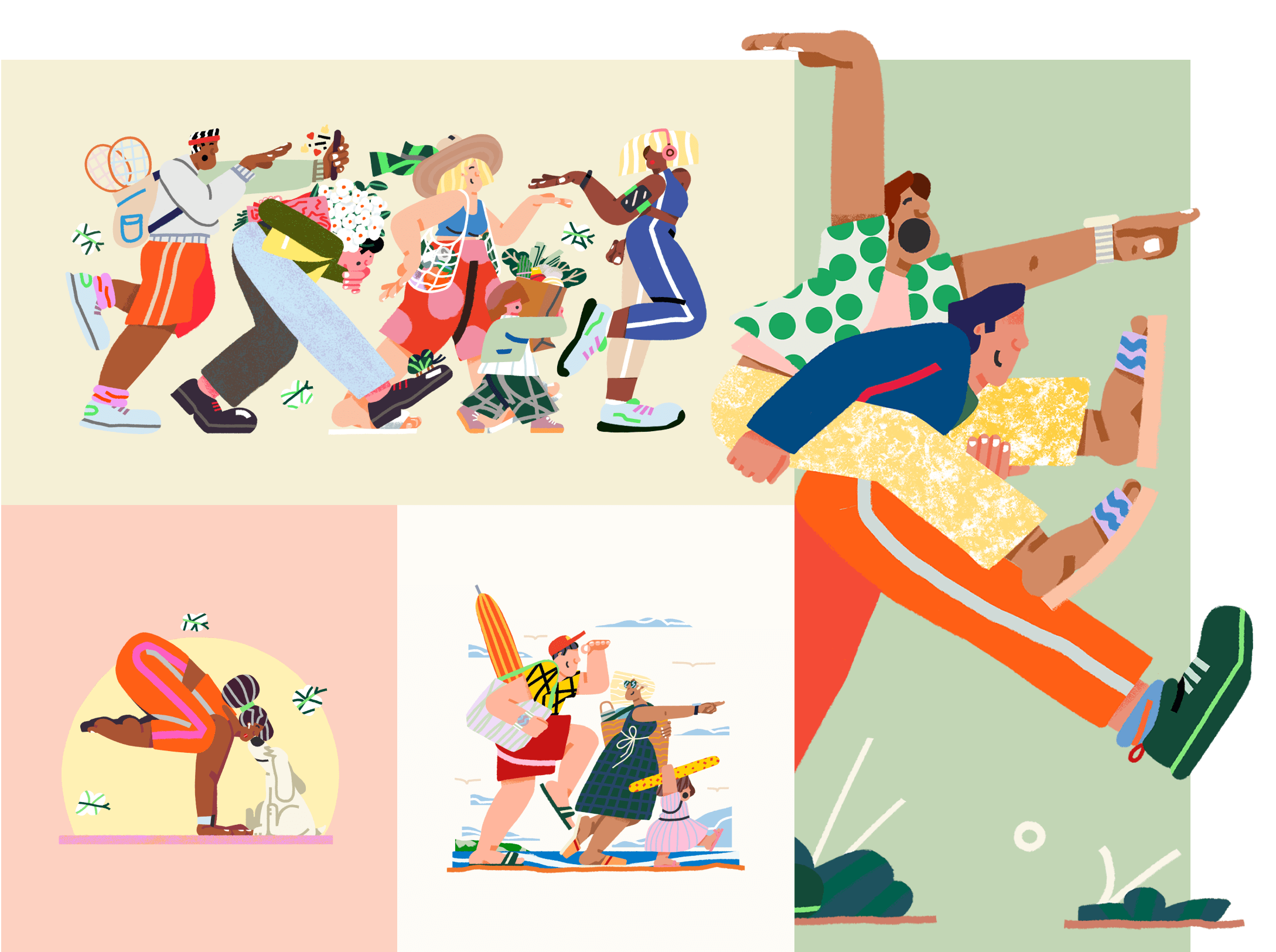
Break-out illustrations
By utilising transparent (alpha channel) backgrounds, these illustrations provide a unique design opportunity to challenge rigid page structures. Illustrations are the only elements within Mesh that are permitted to 'break out' of their parent containers, and as such, should be used carefully to preserve their effectiveness as a 'moment of delight'.
To ensure consistency across uses, consider the following guidelines:
- Colors should be bright, warm and complementary to our brand palette
- Subjects should typically be looking and/or moving towards a north, east or north-east direction (left to right, upwards)
- Consider diversity and inclusion - ensuring usage of illustrations is inclusive and intersectional across pages, products, flows and experiences.
- When 'breaking out' of parent containers, ensure that responsive behaviour does not cause illustrations to obscure important content or interactive elements.
Graphic frames & backgrounds
nib's brand guidelines provide a facility for usage of a graphic arrow, derived from the company logo, as a background elementfor illustrations and as a photo frame, with specific guidelines around its usage.
Illustration background
In this usage case, the arrow may be used a bold background graphic behind an illustration, and sits in the top right corner of its parent container, hinting at sunlight. To preserve the 'north-east' movement of our graphic and illustrated elements, the arrow should never be flipped or rotated.


Arrow photo frame
Our graphic arrow can also be used as a frame to stylise our use of photography. This frame provides another bold graphic element to accompany branded content, and imbues our photography with a sense of positive movement and optimism.

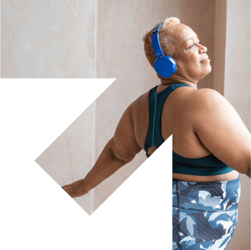

When selecting imagery for use in this context, ensure that subjects (particularly faces) are contained within the key visual safe area, outlined below. Our arrowFrame component in Figma is based on a 480px square, overlaid with a 30x30 grid and safe-area guide, and can be scaled dynamically.

Arrow photo frame don'ts
To ensure appropriate use of arrow frames, we've put together a few guidelines of what to avoid when selecting photographs.
- Peaks or edges should not cover or cut off the face of any subjects in the image
- Where possible, avoid having the peaks create unnecessary 'moments' within the frame (e.g. 'pointing' to particular elements, subjects or points on their body)
- While secondary or out-of-focus subjects may appear outside it, ensure that the primary visual focus is contained within the safe area.
Contact
For further information and questions regarding the use of imagery please contact the nib Design Communications team via email at [email protected].