Modal
A modal refers to a content box that is displayed in combination with an overlay on a page. The Modal component should be used to present additional content without taking the user out of the current flow. If you can't answer the question "Why does this content need to be in a modal instead of within the page?", you should not use a modal.
Installation
npm install @nib-group/mesh-modal
Note: You will also need to install the peerDependencies @nib-group/mesh-icons and @nib-group/mesh-theme.
Usage
import Modal from '@nib-group/mesh-modal';
Interactive demo
() => {
const [isOpen, setOpen] = React.useState(false);
return (
<>
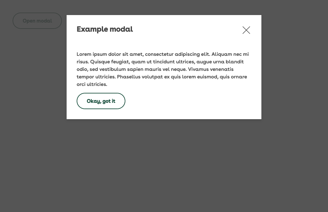
<Modal visible={isOpen} onClose={() => setOpen(false)} title="Example modal">
<div>
<p>This is an example of our modal. It has a dark overlay and a light content box.</p>
<p>The modal responds to the mode it is rendered within. If a modal is added within a "feature" ModeProvider, the background and foreground colors respond accordingly.</p>
<SecondaryButton onClick={() => setOpen(false)}>Close modal</SecondaryButton>
</div>
</Modal>
<SecondaryButton onClick={() => setOpen(true)}>Show modal</SecondaryButton>
</>
);
};
Props
| Prop | Type | Default | Description |
|---|---|---|---|
title | string | The title of the modal. This is rendered above the content on large, and within the content on small screens. | |
titleComponent | string | The underlying component of the modal title.Must be one of h1, h2, h3, h4, h5, h6, div, label, span, header. | |
titleSize | number or object | 3 | The size of the modals title. Must be one of 1, 2, 3, 4, 5, 6. Can be made responsive by passing an object of breakpoints. |
visible | boolean | false | Whether the Modal is being displayed. |
variation | string | dialog | Render alternate variations of the modal. The options are dialog (default) and content which is a fullscreen alternative used to present more detailed content. |
stickyHeader | boolean | false | Use a sticky header. This is only possible when using the content variation of the modal. |
collapseTitle | boolean | true | Collapse the modal title on smaller screens. |
closeOnEsc | boolean | true | Whether the Modal should close on user esc press. Passed through to the Overlay. |
closeOnClick | boolean | true | Whether the Modal should close on user click of the Overlay. |
onClose | function | Handle the close events. |
Design
Light modal
The Modal component responds the mode it is rendered within. If a modal is added within a feature ModeProvider, the background and foreground colors respond accordingly.
Sizing
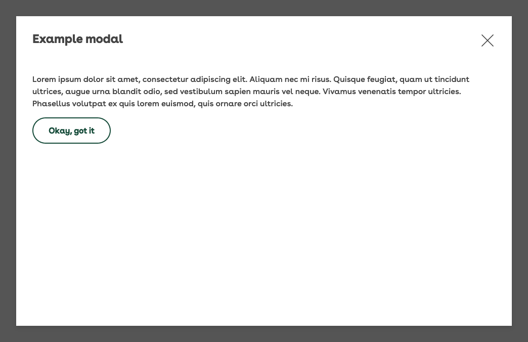
For screens with widths over 640px the dialog modal (default) will be 620px wide and for screen sizes under 640px it will grow to the parent width. For the dialog modal, height is dictated by the content it contains to ensure adequate spacing and layout.
The content modal variation maintains the same small screen styling, but for screen widths greater than 640px, the width of the modal will be 90% of the container with the contents being wrapped in a Container. This can be useful when the contents of the modal is more complex and requires more space.
Interaction
Triggers
To trigger the opening of a modal you should use a single line Link or a Button. Following those guidelines, be sure to tell the user what the content of the modal is prior to them opening it, and use clear and concise language (e.g. "What I'm covered for in hospital"). Avoid contextless requests as labels (e.g. "Click here").
Opening
Never open modals by default
Modals should never be open by default on a page load. Modals should never be opened without direct and intentional action from the user.
To open the modal, fade the modal and overlay in. To give the modal more context, for example if it pertains to information about a left-hand navigation drawer, provide a slide and fade effect (e.g. fade it in and slide to the right to emphasise the connection between modal and navigation drawer). Be sure to position the modal entirely within the current viewport.
Closing
Our modal has a close icon in the top right be default, and should also include a close button at the bottom of the content for long modals with text such as either 'close', 'cancel', 'okay', or another descriptor. The modal should also close when the user clicks anywhere on the Overlay. All opening animations should be reversed on modal closure.
To avoid confusing the user, a modal should never link to a different page on closure.
Scrolling
When appropriate (see Sizing), content inside the modal should be scrollable. To increase usability for all screen sizes (particularly mobile), a 'back to top' button should be included on lengthy modals.
The page behind the modal should not be scrollable while it is open. This ensured the user doesn't becoming disoriented from the content they are engaged with.
Accessibility
To allow for those using screen readers or assistive technology, the following should be adhered to:
- Allow the modal to be closed with the
ESCkey - Allow scrollable modal content to be accessed using the
UPandDOWNarrows - The close button should be auto-focused when the modal opens
- Focus should be trapped to the modal content when it is open allowing for "tabbable" navigation of elements within the modal
- Focus should return to the trigger element when the modal closes (this assists all users, not only those with accessibility needs)