New navigation components released
We have just released our updated global nav with improved information architecture, UI and accessibility.
Our new Global Nav is finally here and is the culmination of hours and hours of work, from many, many people.
What's new?
Improved information architecture (IA)
The IA has been updated based on research conducted over the period of many years (!!!). This was a project that was picked up enthusiastically and set back down reluctantly a handful of times over the last few years. This was frustrating along the way but means that our information architecture is backed by years of research.
Cleaner, more accessible UI
A simpler UI, removing web 2.0 gradient bars and superfluous elements where possible. Component have been made more accessible with proper ARIA attributes applied to interactive elements and tabbing order working as expected moving forwards and backwards through the menu dropdowns.
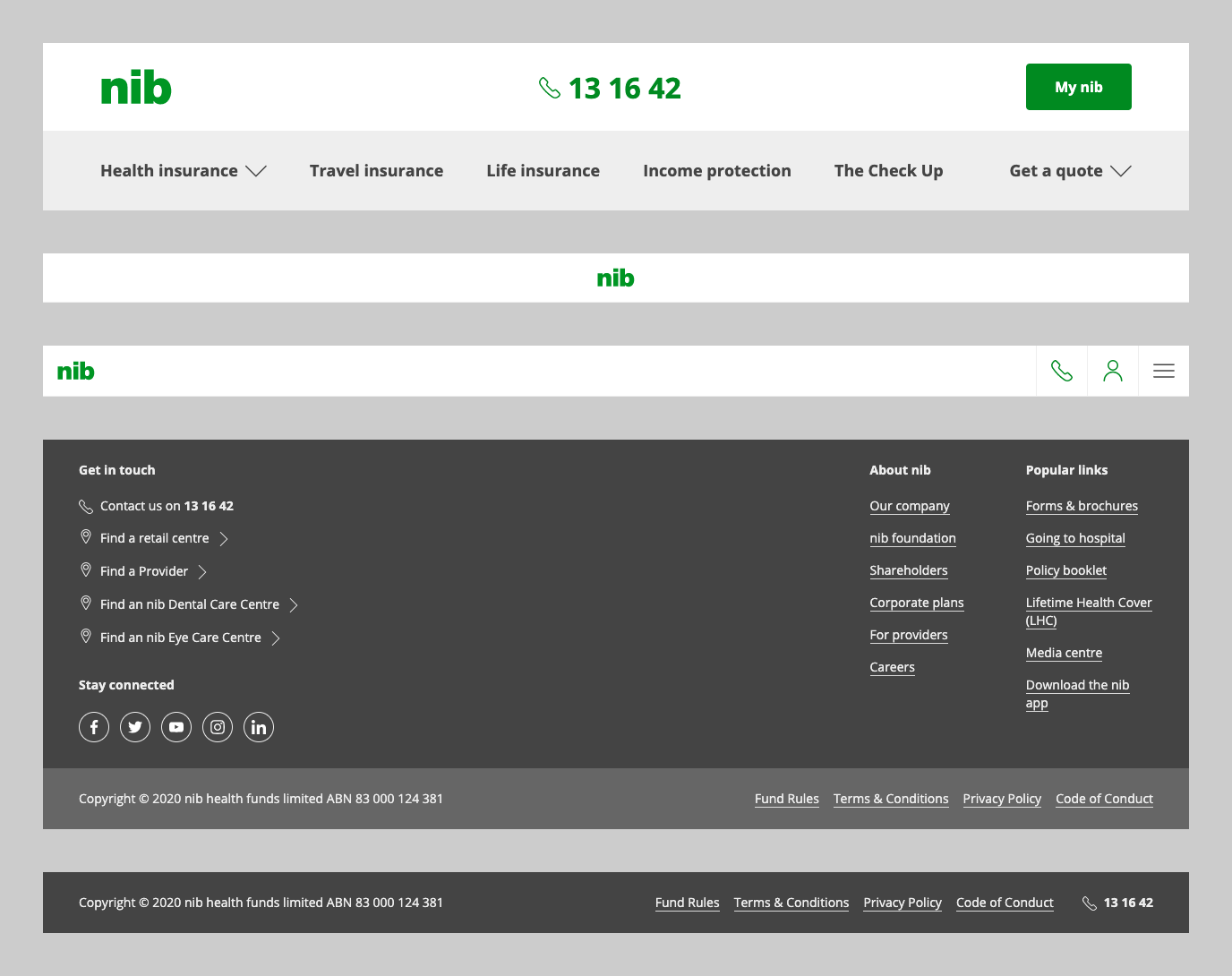
Flexible, composable header footer layout component
A single "layout" component for all of your header/footer needs.
The SmallHeaderFooterLayout component has been deprecated. Instead we have a new smallLayout prop on our HeaderFooterLayout component.
import HeaderFooterLayout from '@nib-group/mesh-header-footer-layout';const App = () => (<HeaderFooterLayout smallLayout>{/* My page goes here */}</HeaderFooterLayout>);
The smallLayout prop defaults to the header with the familiar centre-aligned logo with no navigation links:
However, the entire off canvas menu and icon links can be enabled for the smallheader via the showMenu boolean prop:
When using the HeaderFooterLayout there is a pass-through prop showSmallHeaderMenu which sets the showMenu on the internal SmallHeader.
This can be coupled with the variation prop for business area apecific off-canvas menu links.
In certain cases, you may want a custom combination of Header/SmallHeader and Footer/SmallFooter, or a completely custom header of footer component. To achieve this, you can pass through the component you want in your layout down through the header and footer props:
<HeaderFooterLayout header={MyHeader} footer={MyFooter}>{/* My page goes here */}</HeaderFooterLayout>
This required us to completely re-architecture and rebuild our nav components from the ground up.
Deprecated 'Small' packages
We took the opportunity to consolidate our navigation packages down to a single header, footer and header-footer-layout packages. As such, the folllowing packages have been deprecated:
@nib-group/mesh-small-header@nib-group/mesh-small-footer@nib-group/mesh-small-header-footer-layout
Each has a comparable replacement in the remaining packages:
import {SmallHeader} from '@nib-group/mesh-header';import {SmallFooter} from '@nib-group/mesh-footer';
And for the HeaderFooterLayout there is a new smallLayout prop:
import HeaderFooterLayout from '@nib-group/mesh-header-footer-layout';const App = () => (<HeaderFooterLayout smallLayout>{/* My page goes here */}</HeaderFooterLayout>);
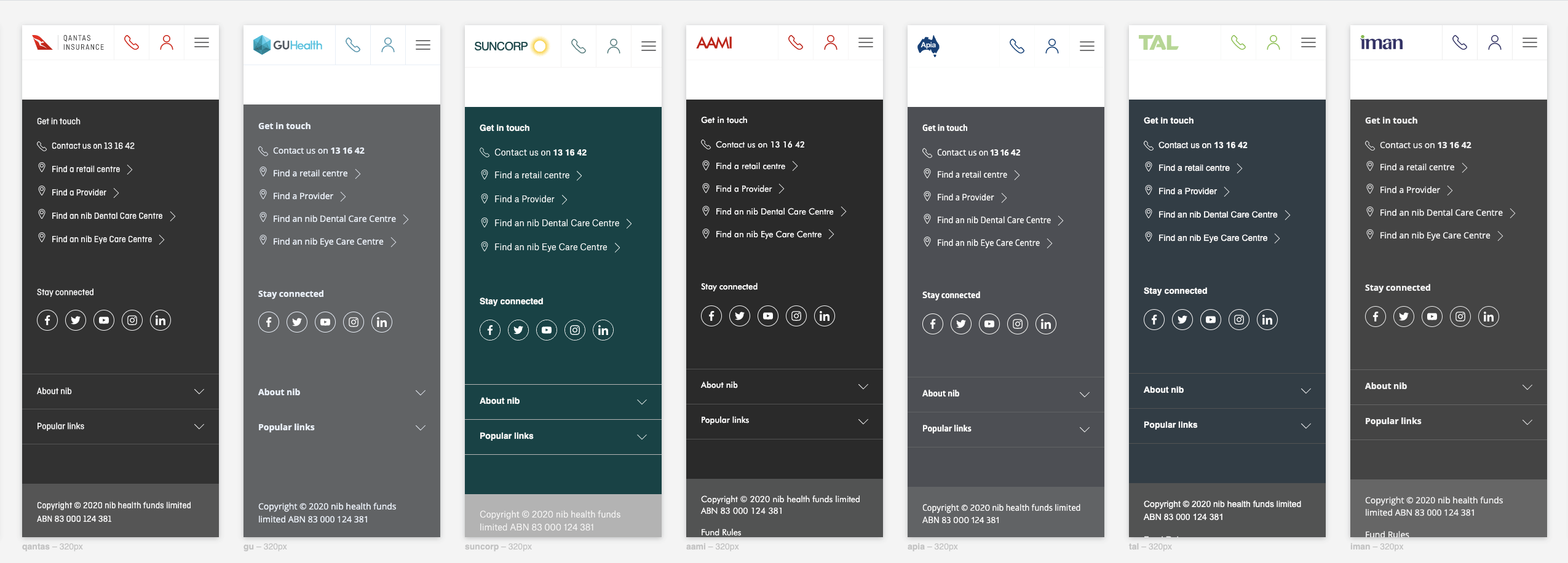
Better white-labelled components
The small variations of header and footer are often used for whitelabelled experiences for our partners. The refreshed, light UI compliments across all brands better than the solid background colour of the brands primary colour.
Check out the components
Here are the Mesh links for each component, which outline any new props and when you might use which variation:
Roll out
We now begin the task of rolling these new components out across the many microsites of the nib Group. DesignOps have a backlog of solutions to update that are currently being targetted by the optimizely nav experiment. Please do try and upgrade your own solutions — we want to push this new navigation out to ensure our users have a consistent experience.
If your solution uses these navigation components, and is relatively up-to-date with Mesh, the update should be simple and pain-free. Solutions with a fair amount of tech debt will require more effort to update but should be prioritised so that we can turn off the performance-draining optimizely experiment currently at 100% across the site.
Also included in our rollout plan is to publish an update to our Sketch Library so that designers can drop the updated headers/footers into their mockups. In the mean time there's always Playroom!
Feedback
Please reach out if you have any questions or feedback about these changes or what you need to do to update your assets. We're available on Slack, Workplace or by email.
Thank yous
A big thank you to everyone who was involved in these changes:
- Jemimah Irvin
- Samantha Diamond
- Ashlea Rendell
- Michael Troy
- Jess Vandenbruggen
- Ben Chandler
- Ben Alexander
- Anjali Wadhwa
- Jordan Collins
- Laurie Jones
- Chris Stonestreet
Posted 15/10/2020