File Upload
File Upload includes components that allow a user to upload one or more files. This component will typically be used when a member needs to submit receipts, images or documents required to validate a claim or utilise online services. It supports drag-and-drop functionality on desktop/tablet breakpoints. FileSelect gives just the user interface while FileUpload also uploads via the native file browser on all platforms.
Installation
npm install @nib-group/mesh-file-upload-component
As a form input, this component can be wrapped in @nib-group/mesh-form-control to provide an accessible label, help text, and validation styling. Note: You will also need to install the peerDependencies @nib-group/mesh-icons and @nib-group/mesh-theme.
Usage
FileUpload - With built-in upload support
import {FileUpload} from '@nib-group/mesh-file-upload-component';import FormControl from '@nib-group/mesh-form-control';import {fileUploadUrl} from '../constants';// `form` comes from formikexport const SupportingDocs = ({form}) => {const [fileState, setfileState] = useState({filesOnParent: []});const [filesReadyForUpload, setFilesReadyForUpload] = useState(false);useEffect(() => {form.setFieldValue('files', fileState.filesOnParent);form.setFieldValue('filesReadyForUpload', filesReadyForUpload);}, [filesOnParent, filesReadyForUpload]);return (<FormControl label="File upload" help="Supported file types: png, pdf, jpg, etc. (<5mb)"><FileUploadacceptedFileTypes=".pdf,.jpg,.gif"setFilesOnParent={setFilesOnParent}filesOnParent={fileState}filesReadyForUpload={filesReadyForUpload}setFilesReadyForUpload={setFilesReadyForUpload}gatewayEndpoint={fileUploadUrl}><Copy align="center">Accepted file types: PDF, JPG and GIF.</Copy></FileUpload></FormControl>);};
FileSelect - Without upload support
import {FileSelect} from '@nib-group/mesh-file-upload-component';import FormControl from '@nib-group/mesh-form-control';// `form` comes from formikexport const SupportingDocs = ({form}) => {const [files, setFiles] = useState([]);const onAddFiles = newFiles => {// Generate an id for files here.setFiles([files, ...newFiles]);// Upload or whatever...};const onRemoveFile = file => {setFiles(files.filter(f => f.id !== file.id));};const onRetryFile = file => {// Do upload etc some retry operation here};return (<FormControl label="File upload" help="Supported file types: png, pdf, jpg, etc. (<5mb)"><FileSelect acceptedFileTypes=".pdf,.jpg,.gif" id="upload-files" name="uploadFiles" files={files} addFiles={onAddFiles} removeFile={onRemoveFile} retryFile={onRetryFile}><Copy align="center">Accepted file types: PDF, JPG and GIF.</Copy></FileSelect></FormControl>);};
Interactive demo
() => {
  const [fileState, setFileState] = React.useState({
    filesOnParent: []
  });
  const [filesReadyForUpload, setFilesReadyForUpload] = React.useState(false);
  return (
    <FormControl id="support-docs" name="support-docs" label="File upload" help="Upload your supporting documents (<5mb)">
      <FileUpload
        acceptedFileTypes=".pdf,.jpg,.gif"
        setFilesOnParent={setFileState}
        filesOnParent={fileState.filesOnParent}
        filesReadyForUpload={filesReadyForUpload}
        setFilesReadyForUpload={setFilesReadyForUpload}
        isCompact={false}
      >
        <Copy size="small" align="center">
          Accepted file types: PDF, JPG and GIF.
        </Copy>
      </FileUpload>
    </FormControl>
  );
};
Props
FileUpload
| Prop | Type | Default | Description |
|---|---|---|---|
acceptedFileTypes | string | "image/*,.pdf" | Defines the file types that can be selected for uploading. |
gatewayEndpoint | string | false | Defines the API Gateway endpoint that does a GET request for an upload link. NOTE: This must be set to https://api-gateway.nib.com.au/file-upload/v1 for production applications! |
setFilesOnParent | function | false | The set function of a React useState, when files have a status of Processing Complete the library will send an array back to the parent using the setFilesOnParent method. |
filesOnParent | array | [] | The variable of a React useState. This is used to compare to the files the library is trying to update. It does not affect the file upload in any way (eg., the library updates the filesOnParent, but filesOnParent has no affect on what the library is doing). |
isCompact | boolean | false | Condenses the FileUpload component. Mostly impacts the UI of the initial state by removing everything but the upload button. Can be set directly on the component, or passed down from the FormControl. |
maxFileSizeLimitInMB | number | Defines the max size of a file upload in megabytes (MB) (inclusive) that can be selected for uploading | |
maxCombinedFileSizeLimitInMB | number | Defines the max total combined size of a file uploads in megabytes (MB) (inclusive) that can be selected for uploading. | |
proxyFileUploadUrl | string | Defines URL to be used to reverse proxy requests to upload files to s3 via presigned url to overcome issue with certain ISPs in certain countries (e.g. China) blocking s3 presigned URLs. | |
children | node | Place any relevant content here. Often used to describe allowed file types and sizes. | |
serviceName | string | Name of the service that initialised the upload | |
internalId | string | Internal ID of the flow that initialised the upload (eg. claim ID) | |
customerId | string | Unique ID of the customer that initialised the upload |
FileSelect
| Prop | Type | Default | Description |
|---|---|---|---|
acceptedFileTypes | string | "image/*,.pdf" | Defines the file types that can be selected for uploading. |
files | array | false | List of files that the component should display. |
addFiles | function | false | Callback when new files are added or dropped onto the component. |
removeFile | function | false | Callback with input of a single file where the delete button has been clicked. |
retryFile | function | false | A retry button is displayed for any files where progress = "Error". Callback when this button is clicked. |
isCompact | boolean | false | Condenses the FileUpload component. Mostly impacts the UI of the initial state by removing everything but the upload button. Can be set directly on the component, or passed down from the FormControl. |
maxFileSizeLimitInMB | number | Defines the max size of a file upload in megabytes (MB) (inclusive) that can be selected for uploading | |
maxCombinedFileSizeLimitInMB | number | Defines the max total combined size of a file uploads in megabytes (MB) (inclusive) that can be selected for uploading. | |
children | node | Place any relevant content here. Often used to describe allowed file types and sizes. |
States & Behaviour
This component has a range of states that change dynamically as the user interacts with the component. Both the target area and individual file avatars respond contextually to user input to communicate progress and validation of uploads.
Target area
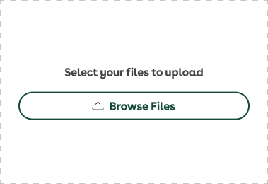
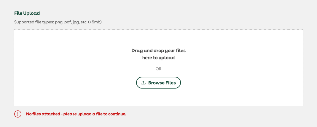
Empty (default)
When no files have been uploaded, or all uploaded files have been deleted, the user will be presented with this default target area. Any children of the <FileUpload>/<FileSelect> will be populated below the Browse Files button. We recommend using the help prop in the parent <FormControl> wrapper to inform the user of the nature of files needed to progress, and suggesting required file size and/or types as children of the <FileUpload>/<FileSelect>.

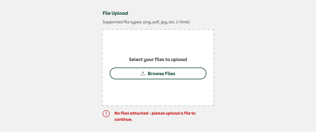
Empty (Mobile Responsive)
As above, an empty target area will load or revert to this state, however on at xs and sm breakpoints, the support copy is modified to remove reference to the drag-and-drop functionality. Drag-and-drop is still technically retained, but given that this will typically be presented in a mobile environment, this state directs the user's attention toward the native file browser of their device.
Drag-and-drop
This state will appear when a file (or files) are dragged from outside the browser window over the target area. On release, the target area will transition to the Ideal state, with any uploaded files appearing in a stacked list.

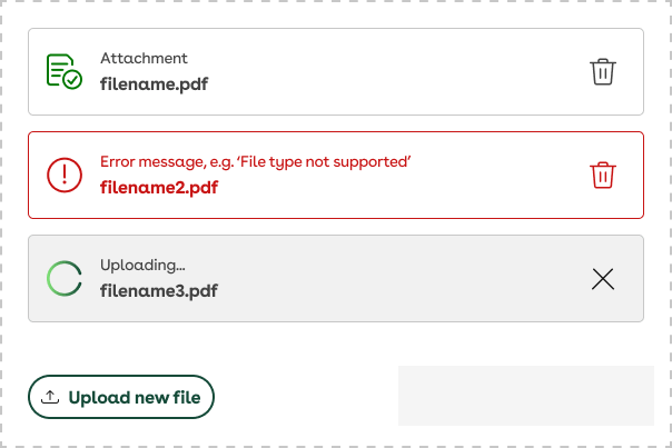
Ideal state
This state will appear when a file (or files) are dragged from outside the browser window over the target area. On release, the target area will transition to the Ideal state, with any uploaded files appearing in a stacked list. Additional files can be added via drag-and-drop or via the Upload new file button.
Ideal (Mobile Responsive)
File avatars
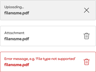
Loading
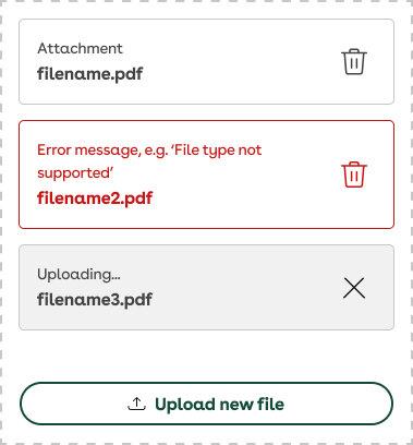
This state will appear while a file is being uploaded. Once complete, it will validate the upload against the supplied parameters and transition to either an Ideal or Error state. A pending upload can be cancelled by the user via the icon on the right. File names will appear truncated if they exceed the bounds of the parent container.

Success (ideal)
A successfully uploaded file will appear as shown. Users can delete already-uploaded files by clicking/tapping the delete icon.

Error
When an uploaded file fails or does not meet the supplied size/format parameters, users will be presented with this state. In the context of a failed upload, the refresh icon will retry the upload, whereas if it doesn’t meet parameters, the icon will prompt the user to select a new file via the file browser. File names will appear truncated as referenced above, but error messaging will wrap and cause the parent container to grow vertically.

Mobile (Responsive)
On mobile (xs & sm) breakpoints, the left-hand icon or loader is omitted to preserve horizontal screen real estate. Truncation and text-wrap behaviours are retained from the default variants.
Compact mode
If your form has a number of file upload fields in the same view, then you may want to condense the size of this component. The isCompact boolean prop reduces the padding and removes everything but the upload button in the initial UI state (when no files have yet uploaded).
This prop can be set directly on the component, or passed down from the FormControl. When isCompact={true}, the children are not rendered. Ensure any useful information regarding accepted file types/sizes is provided in the FormControl help text.
Validations & Errors
While some validation happens in real-time as files are uploaded, if a field is left empty or contains invalid files on submission of a form containing FileUpload, error messaging must be supplied to the FileUpload’s FormControl wrapper. Error messaging on failed submission will appear as below.
Considerations
The <FileUpload> pairs with the General Purpose File Upload backend. As such, most configuration and state management decisions have been made for you and are baked-in. If you require a more flexible file upload input you may need to consider building your own.
FormData
If you are looking to use native FormData apis to handle form submissions that include file upload fields, we have a helpful extra hidden input inside the FileUpload.
Inside the FileUpload is an input with type of file and another that is a type of hidden. When a file is selected and sent to the General Purpose File Upload service it will return a sessionId that is then set on the hidden input. This hidden input can then be included in your form submission to track a reference to the files with the rest of the form submission data.
This hidden input has a name attribute set to ${name}-sessionId so that it can be easily targeted in your form submission. For example, if you have a FileUpload with a name of supportingDocs you can target the hidden input with the name supportingDocs-sessionId.