nib kitchen sink template
The template that has all other email design components, including headers, footers, buttons and more - everything you need to create your own on brand eDM.
The content in this template is meant to be duplicated, removed, or relocated per your requirements. Below you'll find a breakdown of each component and how it can/can't be edited.
Template
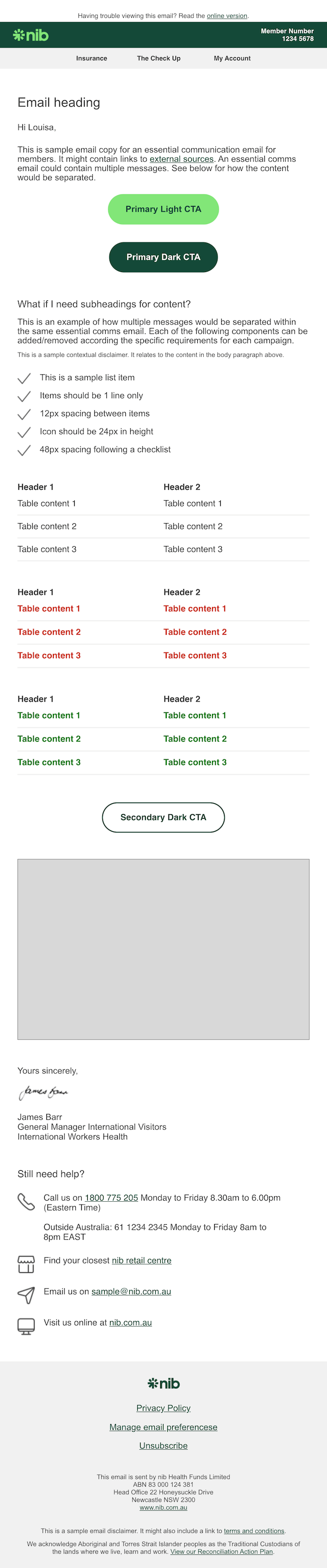
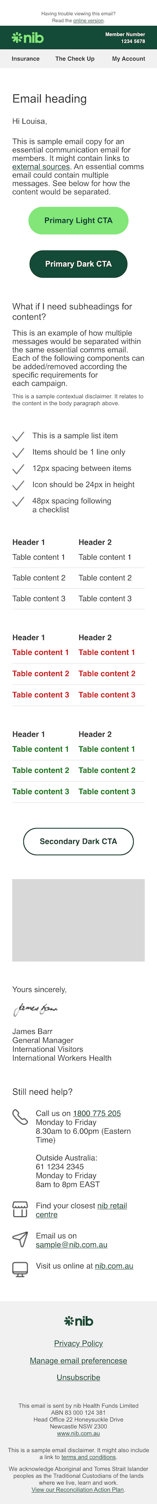
Screenshots
Desktop
Mobile
Header
Do not remove the header
The header should never be removed, only amend as per examples given in the table below
The header content that can be amended according to either the campaign type, or the subsidiary brand, is as follows:
| Current content | Can be amended to... |
|---|---|
| nib core logo | Logo of subsidiary brand |
| Member number |
|
| Navigation links |
|
Email heading
This should be included only once, and give a (very) brief summary of the purpose of the email.
Salutation and opening copy
A salutation should be included in all policy related correspondence. If in doubt for other campaigns, include a salutation. It may not be appropriate to include a salutation in a campaign related to activation or verification for an online account.
Opening copy in a campaign should always be included, and will likely contain the key information for the reader.
Primary CTA
This can be shifted lower than other content, or removed if unnecessary (e.g. for a regulated notification campaign). If relocating be mindful to keep it in the top half of the body content to encourage comprehension and click through. Don't forget you can always include a second primary CTA if the label and action are the same (e.g. "See my quote").
When labelling your primary CTA, do use a single line and be sure to explain what the button will do - e.g. "Login to my account". Keep in mind, you can also use secondary buttons and links if required. If in doubt, check our CTAs & Buttons guide for emails.
Subsection heading & content block
This can be removed, relocated, or duplicated as required to communicate additional content.
The sample contextual disclaimer should be included only when the disclaimer relates to the specific content in the immediately preceding paragraph. If there is no disclaimer, or terms and conditions, it should be removed. Similarly, if the disclaimer you want to include relates to the overall content of the email, it should be included in the sample disclaimer in the footer of the email, as seen in this template.
Checklist block
This can be removed, relocated, or duplicated as required for your campaign. The list can also have more items added, by duplicating line items, or items removed, by deleting line items.
The tick icons are a placeholder only, though in most cases they will still be the most suitable icon to use. If you do choose to replace these with another icon, it must come from our Icon library, and each checklist item must have the same icon. The rare exception to this is when a tick icon and a cross icon can be used to indicate inclusions/exclusions, or complete/incomplete steps.
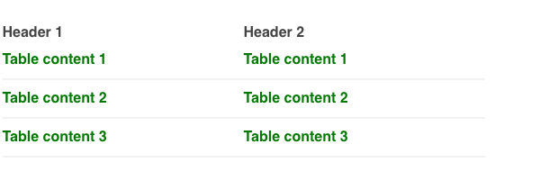
Tables
These can be removed, relocated, extended, or duplicated as required for your campaign.
Our templates, and general email styles, only support tables with a maximum of two columns content. This is due to responsive email constraints, to ensure that meaning is not lost when a user views a table on mobile versus desktop devices.
Default table
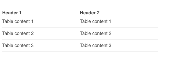
This should be used for standard table content. You can add additional content to the table body by duplicating the required number of table rows (indicated in the markup).
Warning table
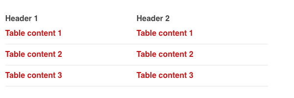
This should be used to draw attention to content indicating a problem for the reader. For example, to highlight an overdue account payment.
You can add additional content to the table body by duplicating the required number of table rows (indicated in the markup).
Success table
This should be used to draw attention to positive table content. For example, to highlight successfully paid claim information. It could also be used to indicate upcoming policy payments required, or for policy payment receipts.
You can add additional content to the table body by duplicating the required number of table rows (indicated in the markup).
Secondary CTA
This can be shifted lower, higher, or removed if unnecessary (e.g. for an online account activation). If relocating be mindful not to reposition above your primary CTA - this should only be used for a secondary action you wish the user to perform. It is unlikely you should need more than a single secondary CTA - if you have other supportive content to share, thay should be included as links.
When labelling your secondary CTA, do use a single line and be sure to explain what the button will do - e.g. "Login to my account".
Image placeholder
This is a placeholder for any imagery that you wish to include in the body of your email. Keep in mind the width of your image should be no wider than 536px for desktop, and 272px for desktop. This means the image will be seen full width with padding either side to allow for various displays. Be sure to follow our general imagery guidelines when selecting imagery for use.
Signature block
This should be included in the majority of member communications, and should only be used once per campaign. Always ensure it is the second last body content of the email (prior to the footer) when included with the contact us block. This should be the last body content for campaigns that do not require the contact us block.
The signature image, and the respective name/details should be updated according to the contents of the campaign. This may be removed if unnecessary, for example in a system-generated email relating to an online account activation.
Contact us block
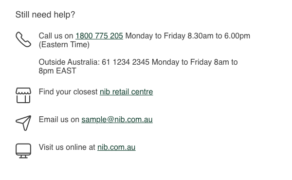
This should not be relocated within the body of the email - it should always be the last body content prior to the footer. If it is unnecessary for the campaign, it can be removed (markup is commented to facilitate this).
Icons displayed are placeholders and can be replaced (if necessary), using only icons from our Icon library. Be sure to consider any existing usage or connotations of the icon you select (if changing them) - to avoid confusing the reader we suggest keeping the existing icons in the majority of cases. The size and spacing of icons and content are pre-defined in the template - do not edit these in any way.
Contact information should be updated according to the product line responsible for the campaign. Individual contact information (e.g. the closest retail centre line) can be removed if inappropriate. We suggest not adding additional contact methods (if there are any), to avoid choice overload for the reader.
Footer
Do not remove the footer
The footer should never be removed, only amend as per examples given in the table below
The footer content that can be amended according to either the campaign type, or the subsidiary brand, is as follows:
| Current content | Can be amended to... |
|---|---|
| nib core logo | Logo of the subsidiary brand. |
| Navigation links (e.g. Privacy Policy, Manage email preferences, Unsubscribe) |
|
| “This email is sent by…” |
|
| Sample disclaimer |
|
| Footer background color | Do not change |