Style guide
Design guidelines for how we create emails at nib. Following these guidelines should come second only to using the provided email templates.
Structure
Email content should be structured according to an inverted triangle, by using visual heirarchy to guide readers on what the most important content in the email is. Emails should be written for a distracted audience, only including the necessary content to communicate the intended message. Visual grouping allows a distracted reader to comprehend related content.
Layout
If creating campaigns outside the provided templates, content should be in a single column layout only to assist with readability.
If required, dual column layouts for including popular content links can be found in the Newsletter template.
Spacing and sizing
Emails should be a maximum 600 pixels wide on desktop, and maximum 320 pixels wide on mobile. This allows for campaigns to render appropriately across various email client preview windows.
Email spacing should generally adhere to the Mesh product design system spacing guidelines, however be sure to follow the following specific email spacing requirements:
- Left/right padding should be 32 pixels (desktop) and 24 pixels (mobile)
- Spacing between sub-sections of content should be 48 pixels (both desktop/mobile)
- Buttons should be spaced 32 pixels below the related content (both desktop/mobile)
- Header should be placed 24 pixels down (both desktop/mobile)
Header and footer
All email correspondence under the nib brand should contain a header and footer as shown below. This provides brand consistency for a reader who may receive communication across multiple departments and product lines. Preference should be given to using the header and footer provided in one of our email templates where possible.
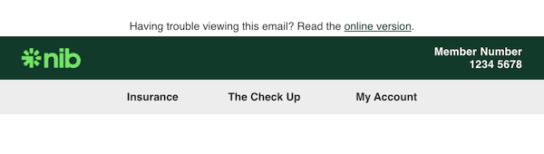
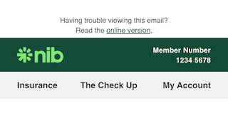
Header
Email headers should:
- Be full width (600px desktop, 320px mobile)
- Be the primary brand color (green) with a white, left-aligned logo
- Contain pre-header text with a link to view online
- Contain member/customer/policy number (as appropriate)
- Contain up to three relevant navigation links on a grey (#e4e4e4) background - except in the case of whitelabelled campaigns, in which they (and the grey bar) should be removed
- Have 24px padding above the pre-header text
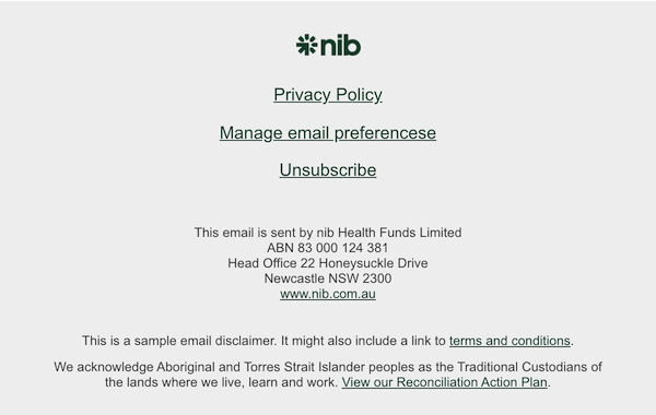
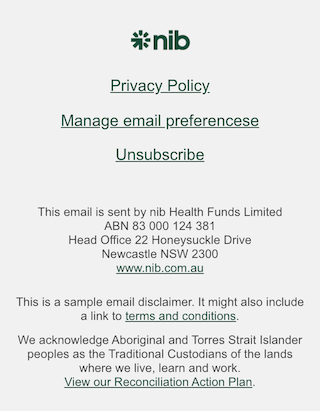
Footer
Email footers should:
- Be full width (600px desktop, 320px mobile)
- Be a grey (#e4e4e4) background with a colored, centred logo
- Contain the correct ABN and address for the business sending the email
- Have an active link from the logo to the appropriate home page
- Contain an active link to an unsubscribe/email preferences page
- Contain all centred text/links
- Contain generic disclaimers (or a link to terms and conditions) which relate to the email content in full
- Contain no more than 4 promoted content links
Email footers should not:
- Contain the entire terms and conditions for competitions, offers, products or promotions - a link should be provided to read them in full elsewhere
- Contain disclaimers relating to a single section of content from within the body of the email - these disclaimers should be included in the immediately following section of the body of the email in size 12 font (see Sub-section content for an example)
Typography
To ensure all typography renders appropriately in all email clients, we have defined the following email safe font stack to be used for all emails:
- Helvetica, Arial, Sans-serif
Body copy in emails should also always be left-aligned to help with readbility on small devices.
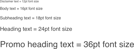
Text size
We use a set of text sizes specific to email to provide consistency for our readers. Be sure to use heading elements in the code for accessibility purposes. All nib emails should use the following text size break down:
Text style
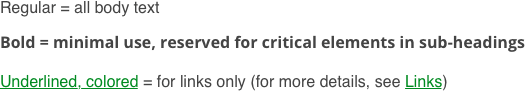
We also use a set of text styles specific to email to create optimal comprehension of content and links.
CTAs and buttons
Each email sent should have a clear goal, made obvious through the use of no more than two different CTA buttons - one primary and one secondary. More information can be found in our Buttons page.
Button types
Primary
Secondary
Button specifications
When designing a button for emails also keep in mind the following:
- The primary CTA should be visible without the need to scroll
- Further CTAs should be included as a Link to maintain the visual heirarchy - but keep to a minimum
- All email buttons should be coded as such to ensure users with images disabled are still able to see the CTA
- Use meaningful link text rather than ‘click here’ for understanding and accessibility
- Button labels should be sentence case
- Button widths should expand to fit their label, or be a maximum 500 pixels width
Images
Some email clients do not render images
Beware some email clients do not automatically render images. This means your reader may miss out on important content if it is embedded as an image. Additionally, those using a screen reader or with images turned off will not see the image content.
Content in images for emails should follow our Imagery guidelines. Additionally, images used in emails should:
- Be a maximum 536px wide for desktop, and 272px wide for mobile
- Be optimised for mobile to support quick loading
- Have alt-text to communicate important visuals for accessibility purposes
- Never have important messaging/words saved in the image file - if absolutely necessary use a background image with live text over the top
Logos
All logo usage in emails should follow our Brand Logo guidelines. Additionally, logos should be used sparingly in the body of the email - preference is given to using logos in headers and footers only.
Icons
Icons must be in PNG format for emails
Note that Mesh currently only contains icons in SVG format, which some email clients do not support. You will need to save available icons in PNG format to use in emails - this will ensure icons render as intended wherever images are supported.
All icons used in emails should come from our Icons page, where we provide pixel-perfect, scalable SVG based icons that are light, simple, and clearly recognisable as the nib brand. We provide both system and graphic icon assets for you to select from. If you can’t find a suitable icon in our library, you can request an icon from our DesignOps team.
Colors
The use of color in emails should adhere to our standard web color guidelines. Backgrounds in the body of the email should be kept to White in the majority of circumstances, though #e4e4e4 may be used for sub-sections in rare circumstances. This ensures you maintain the best contrast for users with accessibility concerns.
Similarly, all typography in emails should be #434343 to ensure minimum requirements for accessibility are maintained. The color of links in emails should adhere to our link - color guidelines.
Unsubscribe
An unsubscribe or manage email preferences link should be included as a link in the footer for all campaigns - terminology may depend on the campaign type. It should be centre-aligned and included in the list of supporting links as seen in our Footer example above.
Testing
Email campaigns should always be client-tested prior to send to ensure compatibility with various email clients and device types. Priority should be given to ensure the campaign renders appropriately for the email client that is used by the majority of users the campaign is intended for - however, always ensure the critical information within the campaign renders effectively for all clients.