Villain Panel
Villain Panel is the antithesis of Hero Panel. It is often used towards the bottom of a page, and gives the user a summation of the page content. Villain Panel mirrors the full-width image of the Hero Panel, and can be used to reinforce the primary message and user action of the page, to offer an alternative user action, or to provide a catch-all action.
Installation
npm install @nib-group/mesh-villain-panel
Usage
import VillainPanel from '@nib-group/mesh-villain-panel';
Interactive demo
<VillainPanel
  images={{
    desktop: '/images/villain-panel/desktop.jpg',
    tablet: '/images/villain-panel/tablet.jpg',
    mobile: '/images/villain-panel/mobile.jpg'
  }}
  title="Young family"
>
  <Stack space={4}>
    <Copy>You've started a family but there's room for more! You're looking for a cover that will include things like pregnancy and birth-related services that meets your family's needs.</Copy>
    <PrimaryButton component="a" href="#">
      Start your quote
    </PrimaryButton>
  </Stack>
</VillainPanel>
Props
| Prop | Type | Default | Description |
|---|---|---|---|
images (required) | object | Images for mobile, tablet and desktop screen sizes. All image sizes are required. | |
title | string | The title of the villain panel. | |
titleComponent | string | 'h2' | The underlying component of the villian-panel title.Must be one of h1, h2, h3, h4, h5, h6, div, label, span, header. |
titleSize | number or object | {xs: 3, md: 2} | The size of the villian-panel title. Must be one of 1, 2, 3, 4, 5, 6. Can be made responsive by passing an object of breakpoints. If you are passing a responsive object, you must provide xs breakpoint value. |
imageCaption | node | An optional caption for the image. Could be used for attribution or to provide context. | |
align | string | left | One of [left, right], The alignment of the content box on desktop. |
boxProps | object | {} | Props to be passed down to the underlying Box component wrapping the content of the panel. All Box props are valid. |
children | node | You are free to render any node as the children of this component. Common components include our Copy, Link and Button components. Please refer to Content placement below for guidance on order of elements. | |
containerWidth | string | Sets the maximum width of the container. Must be one of narrow, default or wide. | |
preloadImages | boolean | false | Opt-in to preloading villain images via <link rel="preload"> tags. Renders preload link tags with responsive media attributes so the browser fetches the appropriate image early. Images are preloaded with fetchPriority="low" since villain panels are typically below the fold. |
Alignment
The content box can be left-aligned (by default) or right aligned, using the align prop. Be sure to check the alignment works with the imagery used without compromising important elements.
Content
If you are using a title, be sure to use the title prop to ensure the correct styling is applied. You can also add additional elements such as a CTA Link or Button.
While you can include 1-2 paragraphs of supporting information under the title, be sure not to include too much text in the content box. The taller the box becomes, the more the background image will stretch.
Content placement
Please refer to the following images for guidance on the placement and order of children components.
Images
Creating image assets
You can use the Villain Panel image template (Photoshop) to create image assets suitable for the villain panel. Download the template and follow the README instructions to produce the required 3 assets.
Image content
You should follow nib brand guidelines for imagery selection when sourcing villain panel images.
Desktop and tablet images should be panoramic-style images, following the size requirements below.
Similar to our hero panel, important elements of the picture should not be in the bottom right quarter of the desktop image as they will be covered by the content box when on mobile.
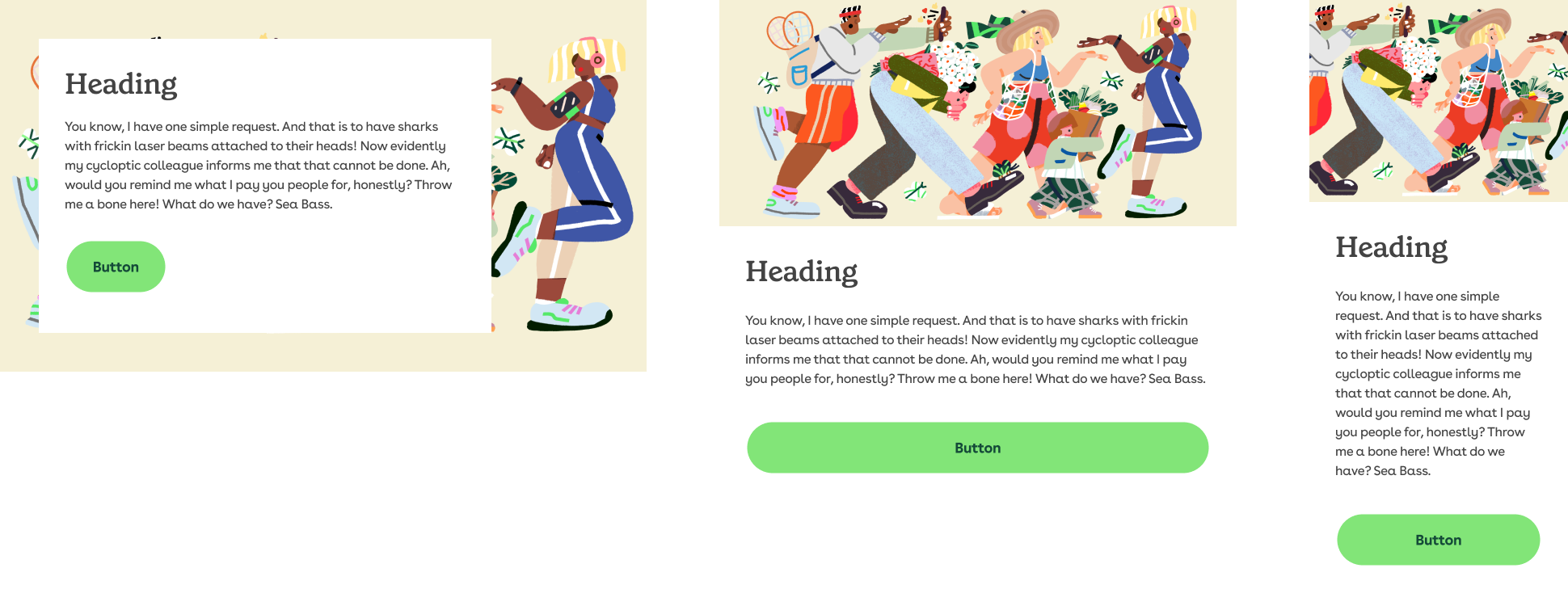
Image sizes
All 3 image sizes are required. Images should adhere to the following dimensions and remain under the allowed file size limits:
Villain Panel does not support retina images.
Unlike Hero Panel, Villain Panel does not support retina images.
| Image | Dimensions (px) | File size limit |
|---|---|---|
| Desktop | 1600x425 | 100kb |
| Tablet | 640x280 | 20kb |
| Mobile | 320x250 | 10kb |
Why background-images over img tags?
Image tags with a src attribute are always downloaded by the browser. We do not want our desktop users to have to download 2 images they are not even going to see.
The browser treats background-image differently, and only downloads the required image for the screen size.