Designing for accessibility
Accessibility enables people with physical and cognitive disabilities, situational disabilities and technology limitiations to perceive and interact with the digital experiences we create. Accessibility is also good for business—by providing a more inclusive experience we acknowledge the diversity of our members and communicate that they are valued and respected.
This guide references Web Content Accessibility Guidelines (WCAG) 2.1
Read the Web Content Accessibility Guidelines (WCAG) 2.1 to learn more.
As designers we know that accessibility is “something” we need to consider in our work. Although, being only a consideration and not something we bake into the experiences we create (often in spite of our best intentions), accessibility can be allocated to the margins of our process. As a result, we may be marginalising many of our users and unknowingly be creating poor or even broken experiences.
The W3C have a succinct statement of what web accessibility is:
The Web is fundamentally designed to work for all people, whatever their hardware, software, language, location, or ability. When the Web meets this goal, it is accessible to people with a diverse range of hearing, movement, sight, and cognitive ability.
From Introduction to Web Accessibility
We'll be using the Web Content Accessibility Guidelines (WCAG) as the framework for this guide. The guide will provide an overview of WCAG with the goal of encouraging further exploration, with the hope that you will become more confident in applying accessibility guidelines and principles to the next digital experience you deliver to the world. It's worth noting that the principles outlined in the WCAG can be applied to mobile apps as well.
This guide serves as that starting point for designing for accessibility and also provides just enough information to uncover the fundamental principles with plenty of links to visit and explore.
A brief history

Tim Berners-Lee at the Science Museum for the Web@30 event, March 2019. Image credit: Jwslubbock - Own work, CC BY-SA 4.0
Before we continue to the Web Content Accessibility Guidelines (WCAG), it will be beneficial to have a brief history lesson and find out when the web accessibility initiative started.
The World Wide Web Consortium (W3C) was founded in 1994 and became the international standards organisation for the World Wide Web. The W3C was founded by Time Berners-Lee who is also credited for being the inventor of the World Wide Web.
Several years later in 1999, the W3C created a project known as the Web Accessibility Initiative (WAI) as an effort to improve the web for people with disabilities. On 5 May 1999 the WAI published the first Web Content Accessibility Guidelines known as WCAG 1.0. The latest official version of WCAG is now at 2.1 with 3.0 currently in working draft status.
Now that we have that short history under our belt, let's check out the current Web Content Accessibility Guidelines.
Web Content Accessibility Guidelines (WCAG) 2.1
Did you know?
Under the Disability Discrimination Act 1992, Australian Government agencies are required to ensure information and services are provided in a non-discriminatory accessible manner. Read more at info.australia.gov.au/accessibility(https://info.australia.gov.au/accessibility).
The best place to learn more about the purpose of the Web Content Accessibility Guidelines (WCAG) is from the source itself. The following paragraph has been taken from the guidelines and provides a clear overview of the subject matter the documentation covers:
Web Content Accessibility Guidelines (WCAG) 2.1 covers a wide range of recommendations for making Web content more accessible. Following these guidelines will make content more accessible to a wider range of people with disabilities, including accommodations for blindness and low vision, deafness and hearing loss, limited movement, speech disabilities, photosensitivity, and combinations of these, and some accommodation for learning disabilities and cognitive limitations; but will not address every user need for people with these disabilities. These guidelines address accessibility of web content on desktops, laptops, tablets, and mobile devices. Following these guidelines will also often make Web content more usable to users in general.
From Web Content Accessibility Guidelines (WCAG) Abstract
It's worth while contemplating the above paragraph and considering the different types of users, disabilities and situations described. When producing your next design think about these users and what might we do to improve their experience. That could be applying appropriate contrast ratios for people with low vision, or arranging content in a manner that makes sense for screen reading technology and keeping language simple and clear for easy comprehension.
The WCAG layers of guidance
An important section of the guidelines are the layers of guidance.
The individuals and organizations that use WCAG vary widely and include Web designers and developers, policy makers, purchasing agents, teachers, and students. In order to meet the varying needs of this audience, several layers of guidance are provided including overall principles, general guidelines, testable success criteria and a rich collection of sufficient techniques, advisory techniques, and documented common failures with examples, resource links and code.
From layers of guidance.
The overarching layer of the layers of guidance are the four accessibility principles. All other layers fit within each of the principles.
Principles of accessibility
The four accessibility principles are outlined below with an example for each provided from the Mesh design system.
Examples provided are short and succinct, so we highly encourage you to explore the guidelines by visiting the links provided to attain a deeper understanding of designing for accessibility specific to your design.
Each example supplied has an accompanying table that states the conformance level met. For further information about conformance visit the conformance section within the WCAG.
Principle 1: Perceivable
Information and user interface components must be presentable to users in ways they can perceive.
There are numerous ways users perceive information we present in our interfaces, that might be by providing text alternatives for non-text content such as images or icons. Content can also be presented in different ways, for example; the sequence of content is arranged in a way that can be comprehended by both visually able users and screen reading technology.
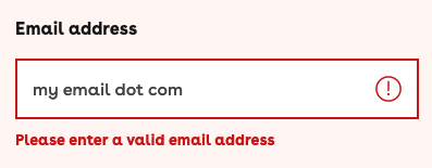
Example: Mesh alert component.
Success! Your cover has now been updated.
Your last name is missing.
We need your last name to locate your policy.
In this example, the following criteria is one of many areas that must be addressed in order to satisfy the Perceivable principle.
| Success criteria | Conformance | Description |
|---|---|---|
| 1.4.1 Use of Color | Level A | Color is not used as the only visual means of conveying information, indicating an action, prompting a response, or distinguishing a visual element. |
Principle 2: Operable
User interface components and navigation must be operable.
There are many users who use a keyboard only to navigate the web. Consideration for these users should be given towards the focus order of navigation links and other page elements. A user should be able to determine where they are within a website or web page. Clear titles and descriptive headings help users navigate content, and also ensure the purpose of links are easily understood.
Example: Mesh header component.

In this example, the following criteria is one of many areas that must be addressed in order to satisfy the Operable principle.
| Success criteria | Conformance | Description |
|---|---|---|
| 2.4.3 Focus Order | Level A | If a Web page can be navigated sequentially and the navigation sequences affect meaning or operation, focusable components receive focus in an order that preserves meaning and operability. |
Principle 3: Understandable
Information and the operation of the user interface must be understandable.
Consistent labeling of interface elements like icons reduces the cognitive load of a user and helps establish a predictable pattern of information. Acronyms, unusual wording or industry specific terms should be avoided when not relevant within the context of the content, and when used, definitions should also be provided.
Example: Mesh graphic icons.
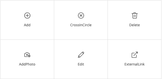
In this example, the following criteria is one of many areas that must be addressed in order to satisfy the Understandable principle.
| Success criteria | Conformance | Description |
|---|---|---|
| 3.2.4 Consistent Identification | Level AA | Components that have the same functionality within a set of Web pages are identified consistently. |
Principle 4: Robust
Content must be robust enough that it can be interpreted by a wide variety of user agents, including assistive technologies.
This also means providing a name, role, and value for non-standard user interface components. When designing forms, provide descriptive labels and validation messages for input fields and other relevant controls.
Example: Mesh form control component.
In this example, the following criteria is one of many areas that must be addressed in order to satisfy the Robust principle.
| Success criteria | Conformance | Description |
|---|---|---|
| 4.1.3 Status Messages | Level AA | In content implemented using markup languages, status messages can be programmatically determined through role or properties such that they can be presented to the user by assistive technologies without receiving focus. |
Where to from here?
It may feel like there is a lot of documentation to dig through which can feel overwhelming. Our hope is that we have provided a starting point for further exploration. When designing your experience, take advantage of the W3C guidelines. Better yet, bookmark them for handy reference. Apply the principles when and where you see they make sense. Always ensure interfaces have sufficient contrast, simple language and enough whitespace so as to not overwhelm your users. Designing for inclusion leads to better experiences for everyone.
It's better to be brave and apply these principles when you can and still fall short, than to not attempt at all. The goal is to create a more inclusive experience with each effort we invest.
The a11y project
Check your WCAG compliance
Check your WCAG compliance with a11y project's checklist.
If you still feel a little overwhelmed and need a more gentle place to start, the a11y project can help.
Accessibility is incredibly important, yet often overlooked in traditional digital design and development education. Because of this, The A11Y Project strives to be a living example of how to create beautiful, accessible, and inclusive digital experiences.
From the About page at The a11y project website.
The a11y project provides resources and tools to help you get started and to make designing for accessibility easier.
Also, if you just need advice, designops is here to help!
Further reading
- A11y project blog posts
- W3C Web Accessibility Initiative (WAI):
- Web Content Accessibility Guidelines (WCAG) 2.1
- WCAG 3.0 public working draft
Resources
Credits
Author: Michael Troy
Reviewers: Laurie Jones, Jordan Collins
Published: 14 April 2021