Hero Panel
A Hero Panel features at the top of a page and acts to support the primary purpose of the page, which could be; to invite a user to further explore the content, to prompt a user to perform an action (when including a button) or simply to support the content of a page. The Hero Panel component works as a system offering three variations; Hero Full, Hero Condensed and Hero Text. These variations are designed to work together or standalone, and to provide maximum flexibility across a range of contexts and experiences.
Installation
npm install @nib-components/hero-panel
Usage
import HeroPanel from '@nib-components/hero-panel';
It is highly recommended you refer to Mesh breakpoints as you decide on your particular Hero Panel implementation.
Interactive demo
<HeroPanel
  images={{
    desktop: '/images/hero-panel/desktop.jpg',
    desktop2x: '/images/hero-panel/[email protected]',
    mobile: '/images/hero-panel/mobile.jpg',
    mobile2x: '/images/hero-panel/[email protected]',
    tablet: '/images/hero-panel/tablet.jpg',
    tablet2x: '/images/hero-panel/[email protected]'
  }}
  title="nib health insurance"
  subTitle="Whether you're young and fit, health conscious, or just want peace of mind, we've got you covered."
  imageDescription="Happy coworkers looking at a laptop at a standup desk"
  variation="full"
/>
Props
| Prop | Type | Default | Description |
|---|---|---|---|
title (required) | string | The title of the Hero Panel. Will be a h1, rendered at the heading size of 2 below the md breakpoint. | |
subTitle | string | The sub-title of the Hero Panel. | |
titleComponent | string | 'h1' | The underlying component of the hero-panel title.Must be one of h1, h2, h3, h4, h5, h6, div, label, span, header. |
titleSize | number or object | {xs: 2, md: 1} | The size of the hero-panel title. Must be one of 1, 2, 3, 4, 5, 6. Can be made responsive by passing an object of breakpoints. If you are passing a responsive object, you must provide xs breakpoint value. |
images | object | Multiple images for mobile, tablet and desktop, at 1x and 2x resolutions. All image sizes are required. See images for more information on using this prop | |
imageDescription | string | A description of the image to be announced by screen readers. | |
imageCaption | node | An optional caption for the image. Could be used for attribution or to provide context. | |
nextSectionBackgroundColor | string | white | The background colour of the next section after the Hero Panel. |
children | node | You are free to render any node as the children of this component. Common components include our Copy, Link and Button components. Please refer to Content placement below for guidance on order of elements. | |
variation | string or object | full | Different variations of the Hero Panel. Can be a string of "full", "condensed", or "text". Or an object consisting of breakpoints. e.g { sm: 'text', md: 'condensed', lg: 'full'} |
backgroundPosition | string | center center | Sets the initial position for each background image. Refer to mdn for usage. |
backgroundSize | string | cover | Sets the size of the elements background image. Refer to mdn for usage. |
containerWidth | string or object | Sets the maximum width of the container. Must be one of narrow, default or wide. Can be made responsive by passing an object of breakpoints. |
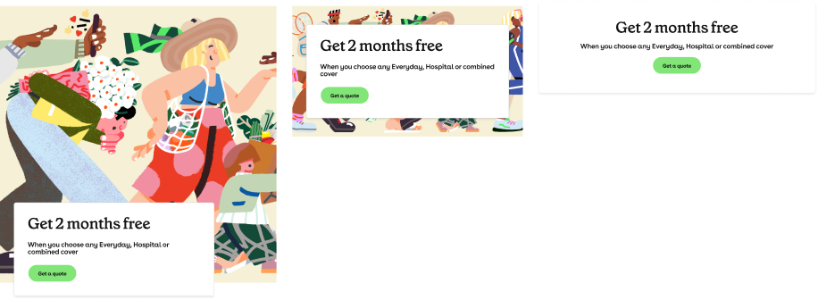
Hero Panel variations
The Hero Panel features a flexible system that is composed of three mobile-first responsive variations:
| Hero Full | Hero Condensed | Hero Text |
|---|---|---|
| Displays an image at maximum allowed height with a bottom overlapping content box. | Displays an image at reduced (or condensed) height with a bottom overlapping content box. The content box is positioned vertical-center within the image at breakpoint lg and above. | Image is removed. Content box styling is simplified with the removal of left green border and box shadow. |
Usage contexts
There are no hard rules set on Hero Panel usage, however the following scenarios may help with deciding which Hero Panel variation to use:
Hero Full
If the purpose of the page is to represent a product then the function of the Hero Panel is to lead a user to explore further page content. Consider using the Hero Full variation.
If the purpose of the page is to act as the main entry point into a site or group of pages, then the function of the Hero Panel is to visually represent the top level in a hierarchy. Consider using the Hero Full variation.
Hero Condensed
If the purpose of the page is to prompt a user to perform an action, such as get a quote, then the function of the Hero Panel is to inform and direct. Consider using the Hero Condensed variation and make sure to include a call-to-action (CTA) button.
Hero Text
If the purpose of the page is to inform or educate and the content is simple, then the function of Hero Panel is to provide a heading that supports the page content. Consider using the Hero Text variation.
Hero combination
There may be cases where even using the same page, the Hero Text variation would provide a better experience on mobile and the Hero Full variation would be a better experience for a desktop user — it is possible to use Hero Panel variations responsively in combination.
Responsive variations
The Hero Panel system is flexible enough that it is possible to use Hero Panel variations responsively in combination.
Pushing this flexible functionality you may have:
- Hero Text variation only on mobile.
- Hero Condensed variation on tablet.
- Hero Full variation on desktop.
Used to represent page hierarchy or importance
Hero Panel variations are useful when used to visually communicate page hierarchy or importance along a user’s journey.
You may use the Hero Full variation for the landing page, the Hero Condensed variation for child (or secondary) pages and the Hero Text variation for supporting (or tertiary) pages such as FAQs or help sections.
Images
Using the scenario under the Responsive variations section, you would require the following images for the Hero Panel variations:
| Variation | Experience | Breakpoint | Image |
|---|---|---|---|
| Hero Text | Mobile | > sm | No image required |
| Hero Condensed | Tablet | > md | Images required |
| Hero Full | Desktop | > xl | Images required |
Please see the image reference tables below for image specifications.
Image description
It is important to provide an "alt text" description of the image for non-sighted users. This description will be announced by a screen reader to provide context to the user about what is contained in the image. Descriptions should be detailed, but also relevant to the context of the page. See the WebAIM alt text page for guidance on writing effective alt text.
Image content
Please be mindful of the positioning and size of the content box when selecting imagery.
In the following example you can see the first image is hidden behind the content box. This can be avoided by moving the image outside of the content area like in the second image.

For help selecting imagery, please contact nib Design Communications team via email at [email protected]. Further information can be found on the Mesh Foundations Imagery page.
Image sizes
Below are handy image reference tables. This chart is a guide only and we recommend that you pay special attention to the file size of the images you use.
The Hero Text variation does not require an image.
Hero Full
| Image | Dimensions | File size limit |
|---|---|---|
| Desktop@2x | 4000x1920 | 400kb |
| Desktop | 2000x960 | 150kb |
| Tablet@2x | 1600x1160 | 150kb |
| Tablet | 800x580 | 60kb |
| Mobile@2x | 800x600 | 50kb |
| Mobile | 400x300 | 25kb |
Hero Condensed
| Image | Dimensions | File size limit |
|---|---|---|
| Desktop@2x | 4000x1200 | 380kb |
| Desktop | 2000x600 | 120kb |
| Tablet@2x | 1600x580 | 120kb |
| Tablet | 800x290 | 60kb |
| Mobile@2x | 800x300 | 60kb |
| Mobile | 400x150 | 20kb |
Photoshop
You can use the Photoshop templates to create image assets suitable for the Hero Full and Hero Condensed variations. You will only need to create images and export for the corresponding Hero Panel sizes you require.
Download the template and follow the README instructions to produce the required assets.
Hero Condensed Photoshop template
Why background-images over img tags?
Image tags with a src attribute are always downloaded by the browser. We do not want our desktop users to have to download 2 images they are not even going to see.
CSS treats background-images differently, and only downloads the required image for the screen size.