Otp Input
The OtpInput component captures one-time passcodes (OTPs) for secure authentication. It is designed to be responsive, accessible and adaptive, with built-in validation logic and messaging to improve a user’s confidence and familiarity with OTP entry.
Installation
npm install @nib/otp-input
Anatomy
Input
Depending on the viewport, the OtpInput presents either a Textbox or a multi-input custom layout. To preserve screen space, below the sm breakpoint the input leverages Textbox’s native styling, including validated states.
To reflect common web patterns and user mental models, on larger viewports (above sm) multiple inputs are rendered, corresponding to the number of expected digits in an OTP (set by the codeLength prop - six by default).
In this context, each input is independently focusable, and is capable of reflecting a range of interactive states based on user input. Validation occurs automatically when the number of valid characters entered matches the codeLength.

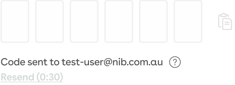
Additionally, both variations include a conditionally-rendered action icon. It is used to;
- enable a user to paste from the clipboard,
- clear any previous user input, or
- display a tick icon to visually inform the user of a successful OTP submission (below sm)
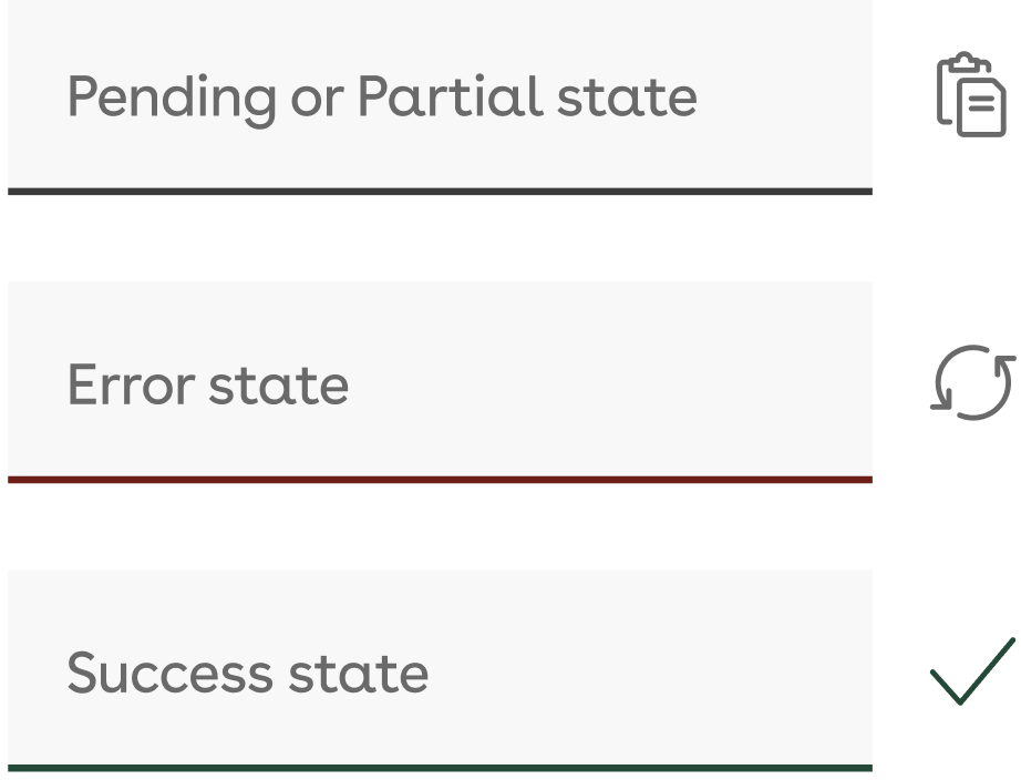
Multi-input states
 | Initial | Displayed on initialisation, or for fields yet to receive user input. |
 | Focused | Highlights the currently-focused field (via click/tap, keyboard or screen-reader navigation) to indicate that it is ready for user input. |
 | Filled | Displays valid characters previously input by the user, prior to validation. |
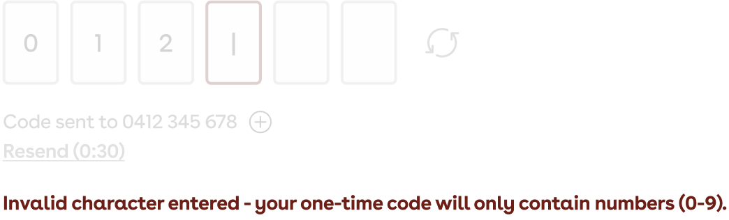
 | Error | Highlights when an invalid character is entered, or when an incorrect code has been validated. |
 | Success | After validation, indicates that a correct OTP has been successfully entered by the user. |
Overlay
When the OtpInput is initialised, a small overlay is rendered over the input, including a Button by which the user can have a code sent to their nominated contact method.
 | Initial | On initialisation, enables the user to request an OTP. |
 | Loading | Is to be displayed while awaiting system confirmation that an OTP has been sent to the user’s nominated contact method. |
 | Success | Once the system confirms an OTP has been sent, this state is displayed momentarily (3s) to inform the user. |
 | Hidden | Once an OTP is sent, the overlay is hidden, revealing the multi-input or Textbox Input. |
Status messaging
Below the Input, the OtpInput renders messaging to inform the user where their OTP has been sent, a clickable Help icon to provide the user with support information, an optional ‘Resend code’ link, and validation feedback.
OTP confirmation
This messaging informs the user where the OTP has been sent, populated via the contactInfo prop. This prop is designed to be provided by the relevant platform, drawing from the user’s settings.
If the information supplied by the prop is incorrect, the Help icon can be clicked/tapped to display a modal, by which the user can be guided and supported in changing their settings. This modal does not provide support information natively, but can be populated via the helpModalTitle and helpModalContent props.
Resend code
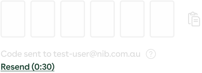
If activated (via the showResendButton prop), the Resend code link allows the user to have a new OTP sent to their nominated contact method. This should invalidate any previously sent OTPs, and may be subject to a ‘cooldown’ timer to minimize confusion between multiple attempts.
Validation messaging
If a user inputs an invalid character, or enters an incorrect OTP, relevant error messaging is displayed below the OTP confirmation messaging. This is styled consistently with how error messaging is displayed in the FormControl component.
Once an OTP has been entered, validated and is valid, a success message is shown, and the Input is styled and disabled to reflect that the OTP process has been completed.

Usage
import {OtpInput} from '@nib/otp-input';<OtpInput contactInfo="[email protected]" validateOtp={code => code === '123456'} sendOtp={() => console.log('Send OTP')} />;
Live example
<OtpInput contactInfo="[email protected]" validateOtp={code => code === '123456'} sendOtp={() => Promise.resolve()} resendCooldown={60} />
Props
| Prop | Type | Default | Description |
|---|---|---|---|
contactInfo | string | Populates the OTP confirmation with the user’s nominated contact method for authentication. | |
validateOtp | (code: string) => boolean | Promise<boolean> | Required. Called to validate the OTP. | |
sendOtp | () => void | Promise<void> | Required. Called when sending or resending an OTP. | |
resendCooldown | number | 30 | Time (s) to wait before allowing a user to send a new OTP. |
codeLength | number | 6 | Number of characters (numeric) in an OTP. |
initialState | 'init' | 'loading' | 'codeSent' | 'waiting' | 'otpSubmit' | 'otpSuccess' | 'otpError' | 'init' | Initial state to display for the OtpInput (e.g. if an OTP is automatically sent on page load, can display the ‘waiting’ state.) |
onSuccess | () => void | Optional callback when validation passes. | |
showResendButton | boolean | false | If true, shows a ‘Resend code’ link. |
helpModalTitle | string | Title for the Help modal. | |
helpModalContent | React.ReactNode | Content to be shown in the Help modal. | |
label | string | A label displayed to the user. | |
formControlType | string | This property determines if the field is required or optional. It will specify whether to render an Optional or Required tag. Must be one of "optional" or "required". | |
help | string | Extra supporting text for the field. | |
id | string | An id for the underlying OTP wrapper. |
Responsive layouts
- On desktop, input fields are rendered individually per digit.
- On mobile, a single input is used for better UX.
Accessibility
- Numeric-only input with built-in validation
- Keyboard support: arrow keys and backspace
- Clear error and success messaging
- Modal uses accessible markup
Custom modal usage
<OtpInputvalidateOtp={code => code === '123456'}sendOtp={() => console.log('Send')}helpModalTitle="Need help?"helpModalContent={<p>If you didn’t receive a code, try resending or check your spam folder.</p>}/>
Async validation example
<OtpInputcontactInfo="0400 000 000"validateOtp={async code => {const isValid = await myApi.verifyOtp(code);return isValid;}}sendOtp={() => myApi.sendOtp()}/>