Newsletter template
The template for newsletter-style communications which feature articles or supporting web pages. Below you’ll find a breakdown of each component and how it can/can’t be edited.
Usage
The newsletter email design is used by the Marketing Automation team within the Salesforce Marketing Cloud platform. The Marketing Automation team have broken down the design into its sub-components within the SFMC platform and as such there is no html template available for download here.
If you have questions about the template or how you might use it please reach out to the Marketing Automation team: [email protected]
Screenshots
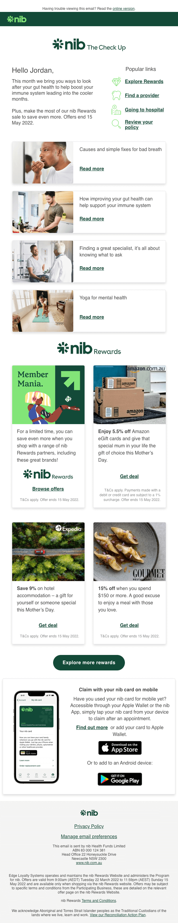
Desktop
Mobile

Header
The header content in this template is intended to be simple to draw attention to the brand logo. The logo can be swapped out for the relevant product/brand line, but should be kept centred on a white background.
Salutation and opening copy
A salutation should be included in most newsletter-style campaigns. The formality of the salutation (e.g. first name only, vs. first name and last name) can be amended as per the campaign/product line requirements.
Opening copy in a campaign should be included in the majority of cases - it could be used for informative purposes or to give a snapshot of what is included in the campaign.
Popular links block
Previous campaigns have shown the engagement value of including these particular links within the checkup newsletters in an easily visible location. For this reason, they should be kept in their present form in the majority of newsletter-style campaigns.
If using this template for a marketing campaign (e.g. perhaps an acquisition campaign), these links can be swapped out for appropriate content, provided the corresponding icon is also swapped out appropriately. If swapping icons, be sure to use only those from our icon library, and be sure to consider any pre-existing connotations of the chosen icon to ensure you don’t confuse the reader.
Featured article
This heading can be changed to the suitable language/meaning. You do not need to adjust any of the styling (e.g. font, size, spacing etc).
This article card can be used for any content you wish to highlight, it does not have to be for a recent article. Simply replace the image, edit the card title (“Do I need life insurance…”), and update or remove the read time and icon. You do not need to adjust any of the styling for this card (e.g. fonts, sizes, spacings etc).
You should only include a single one of these cards - it is not designed to be duplicated. This is to ensure you have a single content piece highlighted in the campaign. If you do not wish to highlight an individual article, remove this section and include any additional articles by duplicating cards in the below.
More this month cards
Similar to above, this heading can be changed to the suitable language/meaning. You do not need to adjust any of the styling (e.g. font, size, spacing etc).
These article cards can also be used for any content you wish to link the reader to - they do not have to be recent articles. You can replace the images, update the card titles, and edit or remove the read time and icon. If required you can duplicate these cards to include additional content links, or you can remove individual cards or the whole section (if they are unrequired). We recommend including no more than 6 article cards in total (5 of these, plus one additional featured article card above).
Primary button CTA
This can be shifted lower than other content, or removed if unnecessary. If relocating be mindful to keep it in the top half of the body content to encourage comprehension and click through. Don't forget you can always include a second primary CTA if the label and action are the same (e.g. “Visit The Check Up”). If you only have a single link you would like the reader to click, it should be linked using this button (in a small number of circumstances a link may be used instead).
When labelling your primary CTA, do use a single line and be sure to explain what the button will do - e.g. "Login to my account". Keep in mind, each of the previous sections have cards with links included, so this may not be the first action a user has taken with this campaign.
Rewards section
This logo can be replaced by any logo appropriate for the supporting content you wish to include. It may be highlighting a partner brand or partner offer you wish to dedicate a section of the campaign to.
Each of the offer cards in this section have been designed to use for offers or promotions being highlighted. The cards can be duplicated if required - though be sure to only ever include an even number to ensure they display appropriately (e.g. 2, 4, or 6 total). The content of each card is editable, simply add an image, update the logo (if required), edit the ‘Get deal’ text as required, and update any promotional copy if you wish to include it. Be sure to always update the ’T&C’s apply’ link, and correct the valid to date if the promotion is not ongoing (delete this copy if the offer is an ongoing one).
These cards are not designed to be used as a promotion panel for product or brand features. If you are looking to draw attention to features, consider instead adding in layout similar to our feature panel (also coming soon in our quote template).
Secondary button CTA
This can be shifted lower, higher, or removed if unnecessary (e.g. for an online account activation). If relocating, be mindful not to reposition above your primary CTA - this should only be used for a secondary action you wish the user to perform. It is unlikely you should need more than a single secondary CTA - if you have other, different supportive content to share, they should be included as Links.
When labelling your secondary CTA, use a single line and be sure to explain what the button will do - e.g. "Login to my account".
'Going to hospital?' block
This content block can be shifted lower or higher in the email content, or can be removed entirely if unnecessary. The icon can be swapped out for any suitable alternative from our Icon Library. Likewise, you can edit the heading and body copy. You can also swap out the content in the dual-column list, and can choose to display these as links to supportive online content (as in the example), simply leave as normal content, or remove the lists altogether.
This is a good option to use if you wish to promote a single important value proposition, highlight a single aspect of a product, or wish to draw attention to inclusions/exclusions of a particular propduct. An example alternative to use for this block could be in highlighting health insurance discounts for under 30s - the icon could be swapped to our Savings icon, the heading could be changed to 'Discounts for people under 30', the body copy changed to an explanation message, and the dual-column list removed.
Footer
Do not remove the footer
The footer should never be removed, only amend as per examples given in the table below
The footer content that can be amended according to either the campaign type, or the subsidiary brand, is as follows:
| Current content | Can be amended to... |
|---|---|
| nib core logo | Logo of the subsidiary brand. |
| Navigation links (e.g. Privacy Policy, Manage email preferences, Unsubscribe) |
|
| “This email is sent by…” |
|
| Sample disclaimer |
|
| Footer background color | Do not change |